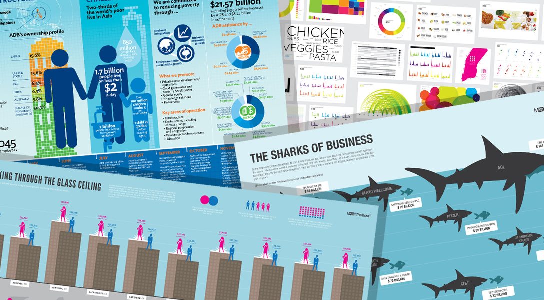
A look at how charts and graphs are creating a new visual language and changing the way we interpret data.
We live in the era of Instagram. Attention spans are short, people read less, and the graphic presentation of information is the new language of the 21st century.
Today, everything from our bills to corporate PowerPoints to political information is “written” in this new lexicon. It’s one that requires an understanding of the grammar of data visualization.
That’s the focus of this week’s WhoWhatWhy podcast, as we talk with University of Miami data journalism professor — and author of the book How Charts Lie — Alberto Cairo.
He explains that graphs and charts are more than illustrations. They are “visual arguments” that require interpretation, and an ability to read them, that goes beyond the initial impressions on the human eye.
In many cases, data visualization amounts to a form of propaganda, or “fake news,” that has evolved to be as sophisticated as the society that produces and consumes it.


Click HERE to Download Mp3
Full Text Transcript:
As a service to our readers, we provide transcripts with our podcasts. We try to ensure that these transcripts do not include errors. However, due to time constraints, we are not always able to proofread them as closely as we would like. Should you spot any errors, we’d be grateful if you would notify us.
| Jeff Schechtman: | Welcome to the WhoWhatWhy podcast. I’m your host, Jeff Schechtman.
The old saying goes that, “statistics never lie, but liars always use statistics.” This might just as well be said for charts, graphs and other forms of data visualization. In an era when people read less, when attention spans are shorter, when graphic presentations on everything from bills, to Facebook, to corporate PowerPoint and political ads surrounds us, it’s more important than ever that we understand exactly how to read this new lexicon. It’s like learning to read all over again for a 21st century language. We’re going to talk about that today with my guest, Alberto Cairo. |
| Jeff Schechtman: | Alberto Cairo is the Knight Chair in Visual Journalism at the School of Communications at the University of Miami. He’s the author of several textbooks and consults on data visualization with companies and institutions like Google and the Congressional Budget Office, and it is my pleasure to welcome Alberto Cairo here to the WhoWhatWhy podcast. Alberto, thanks so much for joining us. |
| Alberto Cairo: | Hi Jeff. Thank you so much for having me. What a wonderful introduction, thank you. |
| Jeff Schechtman: | Thank you. I want to first of all talk, I mean you’ve been looking at this for many, many years. The number of charts, the amount of information and data that comes at us today in a visual form. Talk a little bit about how much greater it is than it has been at any other time. |
| Alberto Cairo: | Oh yeah, it’s absolutely greater than ever. Graphs, charts, data visualizations, visual displays of information such as maps and infographics, they have existed for centuries, right? Some of the main landmarks, landmarks in the history of these fields, you know, date back from the 19th century and 18th century. But in the past, I would say 10 or 20 years, there has been an explosion in the use, in the use of graphs and charts. And part of the reason is that data is everywhere. It’s easier to find than ever. And it’s also easier to graph, easier to visualize than ever because there are plenty of free tools that anybody can take advantage of. This is great news obviously, because I teach this stuff, so the more people embrace this field, the happier I feel. But at the same time creating a graphic, that’s just a matter of using a tool such as, you know, Excel or PowerPoint and things like that, there is reasoning behind it. Which is what I tried to explain in the book, how to approach charts critically as a designer but also mainly as a reader. |
| Jeff Schechtman: | When one is looking at charts critically, are you finding today that much of the chart, many of the charts that are wrong or that convey misinformation, are intentional or is it simply people that don’t really fully understand how best to use the tools that are available? |
| Alberto Cairo: | It is actually the latter. Most of the examples that appear in How Charts Lie are actually, are not just the product of a person trying to lie on purpose. They are example of graphs and maps and charts that were mainly I think created with the best of intentions. But before, because we lack attention, or we don’t read them carefully, or we project what we want to believe onto them, we end up misreading them or reading too much in them. This happens very, very often. And there are plenty of examples in the book about these. |
| Jeff Schechtman: | Right. Talk about the projection aspect. People projecting what they want to believe, that they provide a kind of confirmation bias even when that’s not intended. |
| Alberto Cairo: | Correct. So the example that opens up the book is perhaps a perfect one to illustrate this problem. Because I, well first of all, let me say before I proceed to explain this example, that this happens to everybody. It happens to me, it happens to you. It happens to everybody, that we may all fall victim to, victims to the confirmation bias and to projecting things that we want to believe onto graphs, maps, et cetera. So the example that opens up the book is the map representing the results of the 2016 presidential elections in the U.S. at the county level. And this is a map that President Trump and many supporters of President Trump’s love just because it’s a map that looks like an ocean of red with a few spots of blue here and there. And they use that map to argue on one hand that President Trump won, he got a huge victory in the 2016 election or he has huge popular support, right? |
| Alberto Cairo: | Again, because it has tons of red and very little blue. The challenge is that the map was not designed, originally it was not designed to show popular support, or to show the popular vote, in an election. The purpose of that map is to show who won where, right? Which counties voted more for Trump, which counties voted more for Hillary Clinton and, but each of these is being used with a completely different purpose to basically read in it a popular support. And the challenge is obviously that it doesn’t show popular support because 80% of that map is covered in red. Just because counties that tend to vote more Republican tend to be more sparsely populated and counties that tend to vote more Democratic, they tend to be urban. Therefore they are much more densely populated. They are a smaller in size but bigger in population. |
| Alberto Cairo: | So this is one of these cases, of the many cases in the book in which I bet I used to say, “it’s not that the map is wrong, or that the data position is wrong, or that the graph or the chart is wrong, it’s our interpretation of the chart that is wrong”, and this, this is, most of the cases of the book are like this. |
| Jeff Schechtman: | And are there a set of rules that one can look at to really refer to in putting this data visualization together? Is there a grammar to charts and graphs? |
| Alberto Cairo: | Correct, there is a grammar. What that grammar consists of and the elements of graphs and maps and charts that we need to pay attention to whenever we are reading anything. The most obvious ones are for instance, disor… Well first of all, beforehand, we need to pay attention, that’s the prerequisite, right? The challenge that I have observed for all the years is that people attend to approach charts and graphs and maps, I see, where they use illustrations, something that we can just stare at for just one second and we may walk away from it, you know, thinking that we have interpreted it correctly. |
| Alberto Cairo: | And what I advocate for is basically a culture of attention. Whenever I see a graph, a chart or a map, don’t just look at it, read it. Because a chart is not an illustration or a picture. A chart is a visual argument and in order to understand it, you need to read it, not just see it, not just seeing it. Pay attention to the axis of the chart, pay attention to the legends, to the scales, to what is being measured by the chart. Take a look at the source of the chart, where the data comes from. Try to assess whether the chart contains a sufficient amount of information to tell the story that it claims to be telling, and so on and so forth. So I provide sort of like a checklist of things to pay attention to whenever I see any sort of visual of this type. |
| Jeff Schechtman: | What about the sophistication of the people that are creating charts today when they specifically want to misdirect or misinform? It seems that there really are people that are extremely sophisticated at it, which makes this process so much more difficult for those that are looking at them. |
| Alberto Cairo: | Correct. There is always going to be bad actors out there and I’m not claiming that, you know, that it’s just the blame, it’s not just the reader to blame for misinterpreting charts. There are many cases in which a chart, I feel, would be fine in purpose, can mislead people. What I cannot tell is whether there has been an increase in the purposeful misuse of charts to mislead the public. That I cannot tell. But there are ways to, again, to defend ourselves against it. It’s all, many of the tricks that tricksters use to mislead us with charts are actually quite easy to identify. |
| Alberto Cairo: | Such as, for example, you know cropping the axis of bar graphs or cropping the horizontal on the scale of a line chart to show you, for example, the variation of the unemployment rate instead of showing you several years, so you can’t see the big trends and patterns in that curve. Perhaps they cropped the chart to just show you a specific point in time that helps them push their own agendas. So all these little tricks can, most of these little tricks, can be identified quite easily, if we pay attention. If we would just pay attention to the, to the data and to the numbers and to the graph. |
| Jeff Schechtman: | To what extent can technology be helpful, not just in creating graphs and charts and data visualization. To what extent can technology be helpful in interpreting them, using things like AI, et cetera? |
| Alberto Cairo: | Well, there, there has been some efforts in the past, in the past decade or so to have machines extract meaning from charts. So companies such as Google or Microsoft, I’m thinking about, there is a tool by Microsoft called Power BI for example, and many others that are trying to basically extract automated insights from graphs and from data. So the machine will take a look at the data and they will tell you, “well, I have observed that the biggest number in this series is this year. Or I have observed that in this comparison of a population of different countries, the biggest one is such and such, the smallest one is such and such. Or in this comparison between two variables, I can see that there is a strong association between, I don’t know, wealth and life expectancy or something like that.” So the machine can automate all these, this is automatable. However, I must say though, that interpreting graphs, I feel that interpreting graphs, maps, charts, et cetera, will always require a human eye and a human brain to be successful. |
| Jeff Schechtman: | Well, take that a step further. I mean it seems to me a kind of interesting loop that we could get into, in that once there’s so much data out there that AI can be used to create some of these graphs and then we’re using AI and algorithms to interpret the graphs and charts. |
| Alberto Cairo: | It will be sort of like the, a war between machines. |
| Jeff Schechtman: | Right. |
| Alberto Cairo: | Like machine against machine. Yeah, it could happen, I don’t know. I am not an expert in machine learning or artificial intelligence, the University of Miami has many experts in that field. But what I mentioned in the, in the book though, and it’s related it to your question, is the fight, the fight against misinformation or disinformation or propaganda, it’s always, it has always been an arms race. |
| Alberto Cairo: | If you take a look back to the ’30s or even the ’20s or earlier, and you take a look at let’s say Soviet propaganda or Nazi propaganda in the ’30s, they, those examples of propaganda look very crude to a modern, to a modern mind, but it didn’t look crude at the time. They were very, very persuasive at the time. So propaganda is always as sophisticated as the society that produces it and the society that consumes it. So it’s our responsibility as readers to become a little bit more sophisticated. It’s also the responsibility of the tech platforms such as Twitter or Facebook and Google to be, you know, more attentive to disinformation. Also I think that they bear some responsibility on these, but at the end, I think that it needs to be us through our own education and through our own learning, to become more sophisticated readers, more informed readers, in order to defend ourselves against bad propaganda. |
| Jeff Schechtman: | Talk about the evolution in terms of types of charts. You know, we’re familiar with bar graphs, pie graphs, the traditional kinds of information. There’s certainly more sophistication in terms of the way charts are designed. Talk about that. |
| Alberto Cairo: | Yeah, sure. The language of a chart is constantly evolving. So at the same time that we speak about the grammar of charts, I used to say that this grammar is as flexible as traditional grammar. The same way that we can innovate with language and invent new words or new grammatical constructions and so on and so forth. It is also possible to create new graphic forms that go beyond the traditional bar graph, line chart, a pie chart or data mass, right? And this is happening. The vocabulary of visualizations is constantly evolving and therefore it always required constant, constant learning. The traditional graphic ones that we use today, the bar graph, the line chart, these things were invented around the 18th century so they have been around for quite a long time. But other graphs are much more modern. |
| Alberto Cairo: | Think about for example, the scatterplot, which is a very common kind of graphic that is used to show the association between two different variables. As I said before, life expectancy country by country compared to wealth country by country and you use little dots to show the directionality of that association, either positive or negative or no association whatsoever. Well, the scatterplot was invented around the 19th century and there are examples of graphs that were invented literally a week ago or a month ago or a year ago because this vocabulary is constantly expanding in parallel to the needs to display new insights or new stories based on numbers. |
| Jeff Schechtman: | And what are the things that are being invented most recently? What’s at the cutting edge of this data visualization? |
| Alberto Cairo: | Well, I’m actually quite excited, not specifically about new graphic forms, new ways to display data, but by new technologies that are built upon or that extend upon the current capacities of charts. Think about, for example, virtual reality or mixed reality, right? The ability that we have right now through our cell phones or through Google Glass and many devices such as those ones to over impose an information layer over everything that we, everything that we see. This is, just pointing our phone to a certain device or a certain object or a certain store. We may get the statistics from, we may get the numbers in graphical form from that device or from that store. And in the case of virtual reality, you know, I’ve seen many examples recently of uses of virtual reality for exploration. |
| Alberto Cairo: | A while ago for instance, I saw a high resolution reconstruction, 3D reconstruction, of a real human heart and through special glasses, lenses, you could actually walk inside the heart and see the heart from the inside in high resolution. I’m extremely excited about the possibilities of all these technologies that really are mechanisms to expand our own perception and to expand our cognition, which is another thing in the book, right? Good graphics, when they are well used and when they are well, correctly interpreted, they can really enlighten us. They really expand our perception and that’s their power. |
| Jeff Schechtman: | What are some examples that you can give of really effective charts and graphs, things that may not be at the cutting edge in terms of 3D and, you know, virtual realities you’re talking about, but in the more traditional sense, examples that really work well in terms of conveying information. |
| Alberto Cairo: | Yeah. So my favorite, one of my favorite graphs designed in the 20th century, it’s traditionally called or known as the hockey stick chart. It is a chart that shows the variation of average global temperatures from the year 1000 up to the present, and it really shows a story of the warming of the world in the past century or century and a half. It looks like that sort of like a semi flatline in between the years 1000 up to the 1900’s, but then right after, once we get to the 1900’s you see a sudden spike in global, in global temperatures. So this chart was originally designed by a group of climate scientists back in 1998 if I’m not wrong. It became extremely famous in 2001 after it was published in the IPCC report of that year, the Intergovernmental Panel for Climate Change. The chart appeared in the document, in their document in that year. |
| Alberto Cairo: | And it was also the source of a huge controversy because of people who like to deny the evidence for climate change, like to attack that chart. Even if that chart has been reproduced by independent groups of researchers over and over and over and over again, and with little variation. All these reconstructions of the same chart, use of different sources of data, they all show the same pattern, the Earth is really warming, and that should worry us. Well that’s an example of a chart that, if you have an open mind, is quite persuasive and it’s also very memorable. The joke that I usually make in talks is that once you see that, you cannot un-see it anymore. It’s something that basically sticks to your brain. |
| Jeff Schechtman: | What about big data? The amount of data that’s being, because it can be collected so easily now, the amount of data that’s being crammed into these charts and graphs. |
| Alberto Cairo: | Well that can be a challenge. I mean if a chart doesn’t strike the right balance between over-simplifying or over-complicating a story, it can either simplify the data too much or complicate the data too much. So any designer or any creator of a graph needs to try to find a balance in between those, in between those two ends of the spectrum. A chart that shows too little data will not reveal the insights that are needed, will not let you see what you need to see indicated just because perhaps it over-aggregates the data. For instance, think about charts that show only averages, right? The average height of people in this country, it’s such and such. The average height of people in these other countries is such and such. Well that’s not necessarily incorrect, but it’s actually, that average, that mean, arithmetic mean, may hide a lot of complexity. May hide a huge range of possible heights of people in that country. |
| Alberto Cairo: | But at the same time, if you think about that chart and say, “Well, I want more detail,” and suddenly you decide to show the height of every single person in that country, well that will be overwhelming obviously, and you will obscure the data. So what is the right choice in between an average in this case, which may be a too simplistic representation of the data and showing the data in all its richness and granularity and detail. Well there may be a step in between, right, in which you show a sufficient amount of data that lets you compare these countries in terms of heights, people’s heights, correctly without oversimplifying the information and without over-complicating the story. |
| Jeff Schechtman: | What about charts where you can drill into them? Where there’s a basic chart of information that then allows you to go deeper and deeper inside that information? |
| Alberto Cairo: | That’s the power of interaction, right? And we see many examples these days in news media. So that’s the other, you know, those are other technologies or techniques that I’m excited about, that I’ve been excited about for many years. So it’s like the use of animation for example in charts or the use of interaction that lets you drill down and dig deeper into data. Think about for example, election coverage in newspapers, American newspapers and magazines these days. They are usually full of interactive graphics that make you, you know, zoom in to your own block and see how many people voted for each candidate, in your block or in your county or our city or something like that. |
| Alberto Cairo: | I call these, by the way, in a different book, not in How Charts Lie, the me-layer because the power of interaction a when applied to graphs and to maps and to charts, is that it can make you see yourself in the data. It can let you see yourself in comparison to other people, right? That’s the power of interaction needs. It can be wonderful in many cases. |
| Jeff Schechtman: | Is this a worldwide phenomenon, what we’re seeing in the increase in all of this or is it uniquely American? What are your thoughts about that? |
| Alberto Cairo: | It’s not an American phenomenon alone. No, no, it’s, so I am originally from Spain and I’ve also lived in Brazil for many years. And that increase in the use of charts, it’s happening everywhere because data is more available and usually easy to, more easy to obtain than ever. At the same time, tools to create charts are easier to use than ever and many cases they are free and they are open source. So this opens the door, you know, to more, more and more people are starting to, you know, beginning to create charts. |
| Alberto Cairo: | And the way that I approach charts, so the way that I think about charts is very similar to the way that I think about writing. So is there too much writing? Well maybe, but that’s not necessarily a bad thing, right? It all depends on how you absorb that daily show of information. I am happy, for example, that nowadays anybody can have their own, their own web blog or their own social media accounts and express their opinions through writing, right? So why, you know, why see it as a bad thing that people can express, you know, their own views or convey information through charts as well. They are not that different to writing. |
| Jeff Schechtman: | Professor Alberto Cairo, his book is How Charts Lie: Getting Smarter About Visual Information. Alberto, I thank you so much for spending time with us. |
| Alberto Cairo: | Thank you for a delightful conversation. Again, thanks for having me. |
| Jeff Schechtman: | Thank you, and thank you for listening and for joining us here on radio WhoWhatWhy. I hope you join us next week for another radio WhoWhatWhy podcast. I’m Jeff Schechtman. If you liked this podcast, please feel free to share and help others find it by rating and reviewing it on iTunes. You can also support this podcast and all the work we do by going to WhoWhatWhy.org/donate. |
Related front page panorama photo credit: Adapted by WhoWhatWhy from Klaus Bittermann / Wikimedia (CC BY-SA 4.0), Ali Zifan / Wikimedia (CC BY-SA 4.0), and Erica Hargreave / Flickr (CC BY-NC 2.0).


