An examination of the cumulative effect of four decades of stalled income growth and how as a result, 90 percent of workers gave $2.5 trillion of cumulative income to the top 10 percent since the mid-1970s.
In the three decades following World War II, the US saw economic growth that was shared across all levels of income, from the working class to the richest 1 percent. But that changed after the mid-1970s as income inequality increased exponentially during the next four decades.
A new study by nonprofit research organization RAND nails down what really happened. It shows that this rising inequality took a substantial bite out of the earnings of up to 90 percent of American households.
In this week’s WhoWhatWhy podcast, we talk with the authors of the RAND study, mathematician Carter Price and labor economist Kathryn Edwards.
Price and Edwards detail the unique approach they took in putting this report together. Up until now, they explain, nobody had devised a formula to show just how individuals and their families were affected by the rising inequality across the entire income spectrum.
A small example of what Page and Edwards uncovered is that if income had kept pace with broader economic growth, prime-age workers in the 25th percentile of the US income distribution would be making $61,000 today instead of $33,000. Workers in the 75th percentile would be at $126,000 instead of $81,000. Even those in the 90th percentile would be better off than they are now. They would be making $168,000 rather than $133,000.
The clear evidence, according to Page and Edwards, is that the bottom 90 percent of all American workers would be collectively bringing home an additional $2.5 trillion in annual income if economic gains were as equitably divided today as they were before the mid-1970s.
The RAND report makes clear who the winners are: if annual income were distributed today as equitably as it was some 50 years ago, the average one-percenter would be earning $549,000 a year, instead of the current $1.2 million.
Our conversation with Price and Edwards is a data-driven reminder that an unfettered free market will not automatically generate income equality for everyone. Their work is unequivocal proof that a rising tide does not necessarily lift all boats.


Click HERE to Download Mp3
Full Text Transcript:
As a service to our readers, we provide transcripts with our podcasts. We try to ensure that these transcripts do not include errors. However, due to time constraints, we are not always able to proofread them as closely as we would like. Should you spot any errors, we’d be grateful if you would notify us.
| Jeff Schechtman: | Welcome to the WhoWhatWhy Podcast. I’m your host, Jeff Schechtman. Sometimes we hear something so much that it loses its meaning. For several years now, we’ve heard politicians and thought leaders talk about the gap between the rich and everyone else. The idea of the 1% has become embedded in our lexicon and has driven both populist rage and the blooming of 1000 policy proposals. But aside from the talk about how much the stock market has gone up and how much Jeff Bezos and Mark Zuckerberg are worth, we have not really had the language or really the data to examine how it translates to each and every American. That is, until now. |
| Jeff Schechtman: | The RAND Corporation has recently completed a study taking the most thorough look yet at the past 40 years of income distribution. The results are profound, not just because of the scope of the problem, but because of the depth, the degree to which income has not been keeping pace with GDP and productivity in ways that have cost everyone. We’re going to talk about this today with the authors of that report, Kathryn Edwards and Carter Price. |
| Jeff Schechtman: | Kathryn Edwards is an economist at RAND and a professor at the Pardee RAND Graduate School. Her research spans diverse areas of public policy, including unemployment, the science, technology, engineering, and math education pipeline, and labor markets and labor market issues for workers without a college degree. |
| Jeff Schechtman: | Carter Price is a senior mathematician at RAND. Some of his major projects include work on the study and impact of healthcare reform and the assessments of terrorism, risk models, and analysis of defense budgets. It is my pleasure to welcome Kathryn Edwards and Carter Price here to the WhoWhatWhy Podcast to talk about their report, Trends in Income from 1975 to 2018. Carter, Kathryn, thanks so much for joining us. |
| Carter Price: | Thank you for having us. |
| Kathryn Edwards: | Yeah. Thank you for having us. |
| Jeff Schechtman: | Great to have you here. Talk a little bit about how this project came to be, how this report came to be undertaken, and a little bit about what the original plan was. |
| Carter Price: | Yeah. We were approached by a sponsor that was interested in supporting some work to look into how trends in economic inequality have grown over time. I had done some work like that in my previous employment at the Washington Center for Equitable Growth. As we were talking with the funder, we figured out that it would be really useful to look at it going back to as far back as we could go and to look at how income growth has changed over time. As we got into it, I realized that it’d be really useful to pull in somebody like Kathryn that had a very strong background in labor economics. So that’s sort of how we got started. |
| Jeff Schechtman: | Carter, what was the kind of missing ingredient? What were you trying to pull from this that hadn’t been there before in terms of data, in terms of information? What was the missing piece that you were hoping to pull together? |
| Carter Price: | Yeah. This is not the first study on this. There’s been a lot of studies that looked mostly at either trends at the top. They’re really focused on the top 1.15% of the income distribution. There are also a lot of studies that look at the poverty levels over time and some that look at median growth. But we kind of wanted to put it all together in one package so that we could see how it’s changed over time. And then one of the complaints that some portions of the population have when they look at these types of studies is that they don’t like that there has, in fact, been some growth, but it’s not clear what should the growth rate have been. |
| Carter Price: | So that’s where when we were looking at it, we realized that for the first two or three decades after the Second World War, incomes were growing with per capita GDP, and so that might be a good target. That’s one way of thinking about how the whole economy is growing and then to what degree are people benefiting from the growth of the economy? So that was kind of the framing. |
| Jeff Schechtman: | Did you find a particular inflection point when it sort of stopped? You talk about during the ’50s and ’60s that income growth was growing more or less consistent with GDP growth. When did that stop? When did those two things start to fall out of sync? Either one of you. |
| Kathryn Edwards: | Sure. It’s in the mid ’70s. Whenever we look at income over time, we always try to punctuate it through the lens of a business cycle because you don’t want to compare, say, the trunk of a recession to the peak of another period because you wouldn’t really be measuring what’s going on in the economy over time. You’d really be looking at what’s going on in the economy at one point in time that kind of makes it look worse or better. So we examined this through business cycles. In the 1970s, it was a particularly rough economic time period in the United States. |
| Kathryn Edwards: | It’s right as we start to recover from the oil price recession and stagflation that basically the bottom doesn’t really recover growth afterwards. It’s around that time period. You can pick a specific year. You can say that it’s 1973 or ’75, but it’s really around that period that you had this very poor economy and economic performance, two pretty bad recessions not that far apart from each other, that rolls into the recession of the early ’80s. We don’t really recover income graph at the bottom. |
| Jeff Schechtman: | While we weren’t recovering at the bottom, did we start to see at that period a disproportionate increase in terms of growth for those at the top? |
| Kathryn Edwards: | The way you asked it kind of gets at what’s really difficult about this is that saying the word disproportionate kind of assumes that there’s a way that the top and bottom should be growing. That’s what has led to so many reports over time, but also so much disagreement about what should be happening, because even in answering, disproportionate would say that there is some rate at which they should both be growing or that the top should only grow so much more than the bottom. That’s a really hard concept to really wrap your head around. |
| Kathryn Edwards: | So that’s why we use this benchmark of economic growth because it’s not like there’s … In doing work on income inequality and answering questions like that, you kind of either explicitly or more often implicitly decide what should be happening when we answer these questions. That makes the language and the conversation around it very nuanced, but also very charged. |
| Jeff Schechtman: | Carter, you were going to add something? |
| Carter Price: | I was going to say that if we’re talking about proportionality, that it was absolutely the top. Their income was growing much faster than other portions of the distribution. So in that sense, it was quite disproportional. One of our findings was that it was about 300 or more than 300% of the share of GDP. If you think about GDP growing at 100% over the time period, their share of their income grew three times as fast at the top 1% on average. Whereas, the median worker and those who are below the median, it would be the full-time, full-year, prime-age workers is much, much lower, 20% or less. |
| Carter Price: | In that sense, it was disproportionate. But as Kathryn explained, you have to be very careful in your language as to assigning values to things, as to whether something is good or bad. |
| Jeff Schechtman: | One of the things that you talk about in the report is the way in which this trend has continued from this period of time that you’re talking about roughly in the mid ’70s right on through 2018 or to today. Talk a little bit about that in terms of how it relates to your findings. |
| Kathryn Edwards: | I think what’s remarkable about this time period is that it’s such a long economic era, if we were to think about it, to not have more bright spots at the bottom, that it’s not as if what’s happening is that we were fine from 1975 to 2000, but really those two recessions in the 2000s, in 2007, that really stopped progress. What we found to be rather remarkable was that it was a consistent that the bottom grew slower over each of the time periods within this larger era that we’re looking at. I think that we tend to know so much of our understanding of economic progress is really absorbed through the recessions that we live through. |
| Kathryn Edwards: | It’s hard to really understand that there are trends going on throughout business cycles and across business cycles and not just that everything that’s bad that happens in the economy only happens in recession. That’s not the case. Recessions are a particularly acute time period in which many people experience economic hardship. But even when the economy is growing, people can still be growing, but not as much as they could be if they were growing with the economy, or growing but not fast enough. That’s the part that we tried to kind of elaborate on through the analysis with the consistency of the growth at the bottom seems slower than the growth at the top. |
| Jeff Schechtman: | One of the things that seem so surprising is that this trend continues through several business cycles, that every time there’s a recession and then a period of growth that this same formula, for lack of a better word, or the same trend seems to happen coming out of each recession. |
| Carter Price: | Absolutely. There were some periods that were slightly better or slightly worse for different groups and for different parts of the income distribution but, in general, the deviation … There wasn’t that much deviation. This is a time period when we saw massive changes in the labor force. White men were, when you talk about full-time workers, were the majority and now they’re a plurality. So it’s gone that there’s been massive shifts there, a lot more women entering the workforce. There have been just traumatic changes in the structure of the workforce, changes in all kinds of things. But this has been a fairly consistent trend. |
| Jeff Schechtman: | And one of the other things that you point out is that this trend is applicable not just to those at the bottom of the economic ladder, those that might be in the bottom 25th percentile, but those going all the way up to the 75th, 80th, 90th percentile. Talk a little bit about that, Kathryn. |
| Kathryn Edwards: | Right. Just to make sure that it’s clear, because this was always something that was hard for me to understand, was that the percentile is you line up everyone in the US from richest to poorest. When we study income inequality, basically what we’re doing is we’re taking the person that’s 25th from the bottom and we’re looking at his income. And then we do that again 10 years later and do that again 10 years later. So we’re not following a single person over time. We’re looking at a cut point in the distribution over time. |
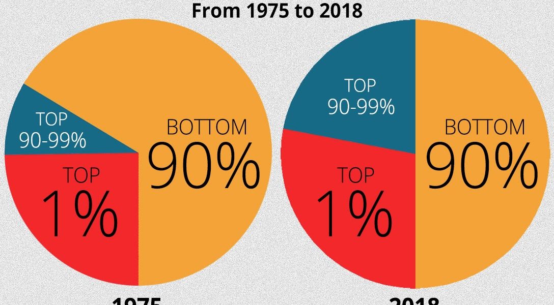
| Kathryn Edwards: | I can’t believe I thought a point in the distribution would be easier to understand than percentile. But I think that it helps that we’re basically taking every American lined up from richest to poorest and then seeing how at these really key points their income is evolving. So when we talk about the bottom 90%, what we mean is that it’s exactly as it sounds, it’s the bottom 90% and that the income threshold that we’re looking at is what divides the 90th person from the 91st. That’s the bottom 90%. |
| Kathryn Edwards: | What’s amazing about income inequality in the United States is how much the shift between the 25th versus the 50th, the 50th versus the 90th, and then the 90th versus the 99th, those are all trends that are kind of moving in similar directions. But at each point and time we see income above the 90th pulling away from income below the 90th. It’s pretty incredible that someone could be in the 90th percent of income and still be, by our definition, being left behind of income growth relative to people just above them. |
| Jeff Schechtman: | Carter, talk a little bit about what we see on the other side in terms of that upper 1%. |
| Carter Price: | Yeah. I mean incomes are just growing much faster than the broader economy, which essentially means because their incomes are growing faster than the broader economy, their share of the broader economy has grown. They may have taken home somewhere around 10% of the income in the mid ’70s. By now they’re taking home twice that or more. Those shares have changed substantially so that the structure of our economy has changed substantially in terms of the amount of control one exerts over the economy and how it influences the economy and where the economy is geared towards. |
| Jeff Schechtman: | Talk about how you defined for the purposes of this analysis, how we define income. Are we talking about stock? Are we talking about real estate? Define how we’re discussing income as it relates across all these categories, either one of you. |
| Carter Price: | I’ll take that one. The income measure that we use, it includes wages and salary. It includes business income, farm income. It includes rent earned. It includes dividends, interest. It does include, for the top 90%, it includes capital gains and those types of earnings. It’s not going to include capital gains for the bottom 90%. Those data aren’t so readily available in terms of how that’s spread across the distribution, so that is sort of a weakness. But it also turns out that that’s not a sizable part of that population’s income, so it may not matter that much. It does not include government transfers, so like Social Security, that kind of stuff. So that’s how we’re defining income, what we’re capturing in this. |
| Jeff Schechtman: | Kathryn, talk a little bit about some of the other trends alongside this that since this period in the mid 1970s may arguably be the reasons for some of this trend that we’re seeing in terms of the demise of unions, et cetera, some of the other outside trends that may be contributing to what we’re seeing here. |
| Kathryn Edwards: | Our paper was really looking at consequence and not cause. We can’t speak to what that is. I also want to say that in clarifying that, that the way that we come up with measurement methodology can help answer that question and re-examine the policy environment over time. if there’s more causal evidence to be found, given that we’ve got these new ways of measuring it, that we put together in this paper. But I mean I would hesitate. I think that for a lot of people … The minimum wage hasn’t been increased since 2007. Unionization is on the decline. |
| Kathryn Edwards: | We’ve had a lot of changes to the tax code. For whatever answer seems obvious to you, there is someone who disagrees with you and the answer that is the opposite is the one that’s obvious to them. They’re going to say that it has to do with regulation of businesses or the change to the tax burden for businesses at the top 1%. I think the problem with income inequality as the number of policy [inaudible] is that people tend to dig into what they already believe and thinking that that’s the solution. Because what we’re basically arguing about here is how to raise the incomes of the middle class. |
| Jeff Schechtman: | One of the things that’s clear here though is that, again, as we talked about before, that the results of this really are from the 90th percentile or cut point down and that it’s the middle class. But it’s really almost everybody except those in the upper 1%. |
| Kathryn Edwards: | Yeah. I don’t know where I’ve heard this, but there’s always some statistic that something like 90% of Americans think that they are the middle class. It might not be too far off from perceptions. I think that we put a number … One of the reasons why our report has gotten some attention is that we’re able to put a number on something that summarizes trends over 40 years of time. To say that the bottom 90th percentile of households are missing out on $2.5 trillion of income in a given year, I think that that’s a very salient number and a tangible result for what people experience in their lives. |
| Kathryn Edwards: | But again I think most people always interpret evidence as aligning with what they already agree and that they’re going to want to say, “And therefore, you should do the thing that I already thought before you told me that number.” As researchers, whatever I think to be the case, it’s important to note that that wasn’t what we were trying to do in the paper. It’s something that we would like to do and bring more evidence to, but it’s not within the confines of what the paper estimated or pointed out. So the policy talk, we really have to be careful to say that that wasn’t necessarily what was supported by our research findings because we weren’t looking for it. |
| Jeff Schechtman: | Carter, is it your sense that that $2.5 trillion that was not brought home by that 90% of the public, did that go to the 1%? Did that go somewhere else? Where did that 2.5 trillion go to? |
| Carter Price: | Certainly a lot of it went to the top 1%. Some of it went to the top 2% or elsewhere like that. Some of it went into higher depreciation costs or other things like that. It’s not in the paper because it gets a little dicey to actually break down where those dollars went, but the bulk of it went to the top one, one-and-a-half, 2%. |
| Jeff Schechtman: | Talk a little bit about how that 2.5 trillion is kind of arrived at. |
| Carter Price: | Yeah. So we essentially looked at the share of the economy that went to income for the bottom 90% in 1975, which was more or less the peak for that segment of the population. And then had the economy grown and had growth been largely equitable, essentially similar to what it had been for those two decades prior, what would the distribution look like? So then once we mapped out essentially the counterfactual that had the shares of the economy remain roughly the same, what would have happened, and then sum that up. It amounted to two and a half trillion dollars. That’s the annual amount for 2018. So if you sum it up, that growth differential over the course of 43 years, it sums up to about $47 trillion. |
| Jeff Schechtman: | As you developed this report, talk about what, if anything, surprised you? I mean no matter how objective you all might have been at the beginning, there had to be certain assumptions. What surprised you the most as this thing evolved and as these numbers came together? |
| Carter Price: | Certainly numbers were a lot bigger than I had expected. I would have guessed maybe a trillion or maybe a little bit more than that. So that surprised me. Digging into some of the very detailed numbers, like in particular one that I was kind of surprised by, but in retrospect makes a lot of sense, I just hadn’t thought about it, was that white men at or below the median, their wages have been fairly stagnant for the last 43 years. Whereas white men at the top have seen pretty steady gains. |
| Carter Price: | At the bottom of the distribution, you see kind of a convergence where African-American men, white and Black women, other people of other races, their earnings are getting closer to that of white men, just for that bottom segment of the income distribution. But that’s not necessarily the case at the top where people are more or less still segregated by income or there are pretty large separations at the top still. So what that means is the inequality, when you’re talking about inequality among white men, has grown faster than inequality in general. That was not something I expected. I probably could have figured it out if I thought about it some, but it was a surprise to me. |
| Jeff Schechtman: | Kathryn, what surprised you? |
| Kathryn Edwards: | Well, something similar, for sure. One of the most prominent and, I would say, remarkable features of the US labor market after World War II is the incredible increase in labor force participation by women. This was a pretty much three-decade steady rise in the number of women who worked. I’ve studied this separately, looking at the effective labor force participation on household income and on economic growth. There’s a whole branch of economics research that looks at this effect. How much did it mean for the economy that women went to work, not just part-time, but actually as part of their career and something that they did even after they got married and had children? |
| Kathryn Edwards: | So I was surprised when looking at the distribution of inequality, that frankly women didn’t look better than they did, because you always approach things from the prism of your own point of view. The point of view I came in with was that we have this economic success story of women getting into the labor force and women earning more money and seeing a growth in earnings. They absolutely did, but I was surprised that it didn’t make more of a difference at the bottom in terms of just the overall growth at the bottom 25% or bottom 50%. |
| Kathryn Edwards: | When we looked at women workers, we absolutely saw the income increases, but it wasn’t enough to pull up the overall bottom of the distribution, which really speaks to the large effect that stagnation of male wages had on the overall distribution, the largest effect the stagnation of white male wages in the bottom half had on the overall distribution of income. |
| Jeff Schechtman: | Is there going to be any kind of follow-up to this, taking this a step further? What more information would everybody want to know? |
| Carter Price: | Well, one follow-up will be that we’re going to … The data for 2019 came out. So we’re working on getting that folded in and getting everything updated for just the 2019 data because that’ll more or less get us up to the current recession. So it will be the next business cycle. But then I think Kathryn has a lot of really good ideas about how we could push this further, contingent upon us on finding people to support the work. |
| Jeff Schechtman: | Kathryn, what else would you like to see? |
| Kathryn Edwards: | We really laid the groundwork here to study inequality in so many directions and on so many levels. So the headline figure is about the overall growth in inequality over the past four decades. But we also built in numerous methodological changes that allow us to make comparisons between Black and white workers that we didn’t make before, or thinking about them in a new way. Because for most of this discussion and for most of the paper, we kind of take at face value that growing at the pace of the economy is a good benchmark rate. |
| Kathryn Edwards: | Like I said at the beginning, it’s really hard when you’re looking at inequality research to say, “This is how much someone or some group should be growing.” But I think it’s really interesting that there’s this … Deciding everyone should grow at the same rate as the economy doesn’t take into account the fact that there was pretty terrible inequalities between groups in 1975, that if they had grown at the same rate would have persisted at the same rates, freezing in time the difference between men and women and Black and white. |
| Kathryn Edwards: | A lot of the work that we’ve been doing on follow-up is to really talk about just how those differences between these disparities that are really embedded into the US economy through the historical disparities and how people were treated in society and in law, can still persist in the economy and how to approach what is the right rate of growth for, say, Black workers versus white workers. |
| Jeff Schechtman: | Kathryn Edwards, Carter Price, their report for RAND, Trends in Income from 1975 to 2018. I thank you both for spending time with us here on the WhoWhatWhy Podcast. Really appreciate it. |
| Carter Price: | Thank you. |
| Kathryn Edwards: | Thank you. |
| Jeff Schechtman: | And thank you for listening and for joining us here on Radio WhoWhatWhy. I hope you join us next week for another Radio WhoWhatWhy Podcast. I’m Jeff Schechtman. If you liked this podcast, please feel free to share and help others find it by rating and reviewing it on iTunes. You can also support this podcast and all the work we do by going to whowhatwhy.org/donate. |
Related front page panorama photo credit: Adapted by WhoWhatWhy from WhoWhatWhy.


